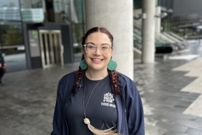
Quick Exit (esc)

Meet the Artists

Our artwork was designed by Yirra Miya. Yirra Miya are a collaborative First Nations Create Agency that works with businesses, entrepreneurs and community drive initiatives embracing cultural story-telling, through branding, design and illustrations.

A smiling woman with reddish-brown hair styled in two long braids. She wears clear-rimmed glasses, large circular green woven earrings, and a long cord necklace featuring a pendant with large, light-colored feathers. She is dressed in a dark navy blue zip-up jacket over a black t-shirt.

Leticia Forbes

Our Logo Artist

Leticia is a proud Wiradjuri and Torres Strait Islander yinaa ‘woman’ and Wiradjuri Artist, with family ties to Narrandera and community ties to Dubbo. She now lives, works, and raises her family on Darkinjung Country, Central Coast.

A smiling woman with fair skin, green eyes, and light blonde hair styled in two braids. She has a friendly, open expression with a wide smile and a subtle nose stud. She is wearing a navy blue zip-up jacket over a dark t-shirt and a thin gold chain necklace with a small circular pendant. Her earrings are small circular dangles featuring the black, red, and yellow colors of the Australian Aboriginal Flag.

Lauren Henry

Our Cultural Elements Artist

Lauren is a proud Wodi Wodi and Walbunja person and artist from the Yuin Nations, living on Country in Nowra, the South Coast of NSW.


Our Logo

The logo tells the story of Our Ways Strong Together and our approach to constructing an impactful approach to address Family, Domestic and Sexual Violence within Aboriginal and Torres Strait Islander communities.

The Our Ways Strong Together logo with yellow centre dot & the large green ring surrounding it highlighted

Community Circle

At the centre of the logo is a community circle, where community stakeholders and service providers are invited to be a part of the impact and change

The Our Ways Strong Together logo with the yellow & brown dashed lines highlighted

Connection to Country

This is embedded through the workings of Our Ways Strong Together. It signifies how vital it is to support each other on this journey and the importance of cultural lore and governance being intertwined throughout the processes.

The Our Ways Strong Together logo with the brown outer layer circles highlighted

Support

The outer layer represents a safety net of support, not only for community but also for service providers and the ripple effect of this peak body to the wider community.

The Our Ways Strong Together logo with the green Journey Lines highlighted

Journey Lines

Represent the different paths people take, not only on their healing journeys but also their connections to service providers. These lines are organics to show that our journeys are not linear and each person’s path looks different.


Our Cultural Elements

An Aboriginal-style digital graphic of an arched, organic pathway representing a journey of "truth telling" for family safety and healing. The arch features concentric layers of green, brown, tan, and yellow, decorated with blue and white dots, dashed lines, and teal "U" shapes representing people. Light blue bird tracks follow the outer brown border, symbolizing movement and the path toward impactful change for the future.

Safety & Healing

This elements represents the need to rely on truth telling to create impactful and beneficial change for the future to keep families safe while on their healing journey.

An Aboriginal-style digital graphic featuring a central circular motif overlapping a larger, irregular organic shape. The central circle consists of concentric rings in tan, yellow, blue, and green, with a gold center and dark brown "U" shapes representing people sitting. Below this circle are several small brown bird tracks. The background shape is a light blue field overlaid with a network of blue lines and dots, suggesting a map or connection, and is bordered by a vibrant green band decorated with white dots and brown "U" shapes.

Collaboration

This element shows the collaborative approach Our Ways Strong Together has in supporting and addressing Family, Domestic and Sexual Violence.

An Aboriginal-style digital graphic featuring a central circular motif with concentric rings of yellow, brown, and light blue. Several small, coral-colored "U" shapes represent people gathered around the inner circles, while larger light-blue "U" shapes radiate from the outer tan border. The entire design is set against a vibrant green, wavy organic background with yellow-orange accents, symbolizing community connection and shared space.

Equity & Inclusion

This element represents Our Ways Strong Together’s deep commitment to equity and inclusion, ensuring our work delivers meaningful benefits for all Aboriginal and Torres Strait Islander people and communities impacted by Family, Domestic and Sexual Violence.

Cultural Integrity

This element represents the vitality of cultural integrity, reiterating that culture is not the cause of Violence in our communities.

An Aboriginal-style digital graphic depicting three meeting places connected by wavy journey lines. The central ochre-toned circle is the largest, linked to two smaller circular motifs by pathways of brown dashes and blue-dotted lines. Each meeting place is surrounded by blue and green organic shapes with small "U" symbols, representing people gathered together and the ongoing connection between communities.

Self-Determination

This element represents self determination being at the forefront of the functionality of Our Ways Strong Together, focusing on community leadership and cultural knowledge.

Search Our Ways Strong Together

The Our Ways Strong Together website is not compatible with Internet Explorer. Please use a modern browser such as Chrome, Firefox, Edge, or Safari for the best experience.